starting in the middle
DESIGN
september 6th, 2017
p. s. flavor spice blends
JUMP TO THE PHOTO GALLERY FOR THIS ARTICLE
In the world of "communication through design", getting to start at the very beginning is almost unheard of. Designing new branding and collateral for a product or service that's already doing business is the norm. Such is the case with the P.S. Flavor!™ Spice Blends by Pam Smith project.
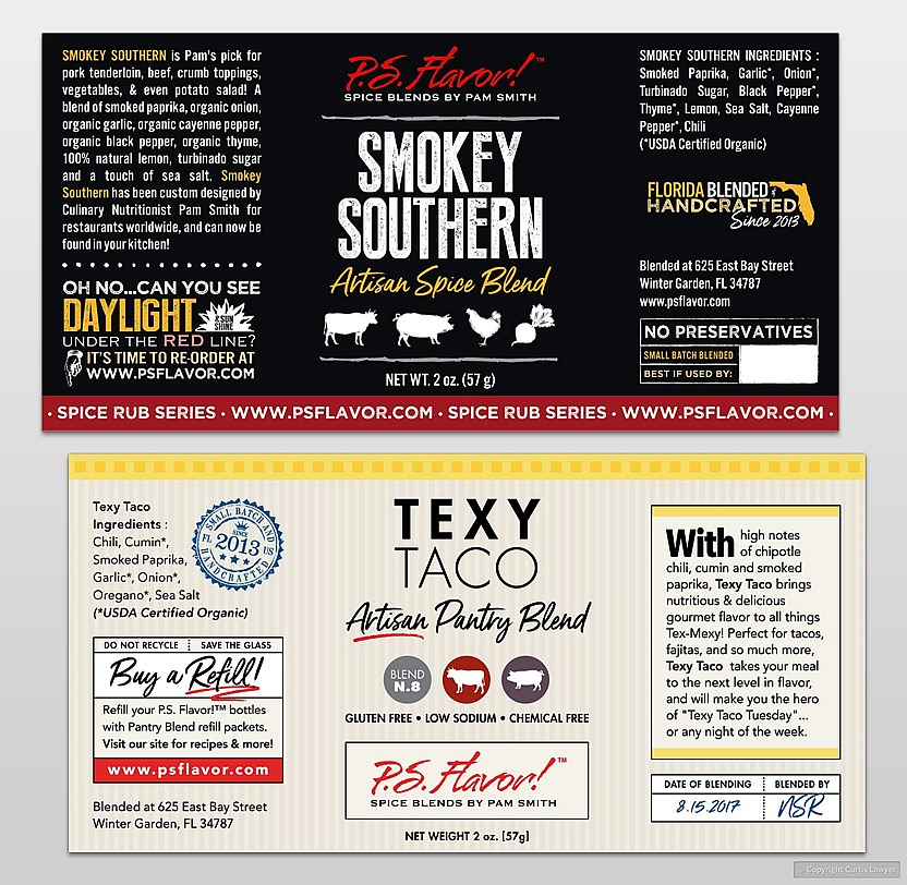
The first of four design sample that were initially created takes cues from a
"chalkboard" look, while the second design is more "family friendly" and colorful.
We were less than 45 days out from the start of Epcot's International Food & Wine Festival, which is an important event for P.S. Flavor! because they are featured prominently in the festival store. The need… was for brand new labeling system for nine different spices. P.S. Flavor! had changed their bottle supplier, and the previous sized labels and format (which was actually three different labels) just wouldn't work with the new bottles.
Nothing was "off the table" as far as what could be done design-wise… any and all elements of the branding system were open to a refresh. A basic farm-to-table notion was in place, but basically… the sky was the limit.

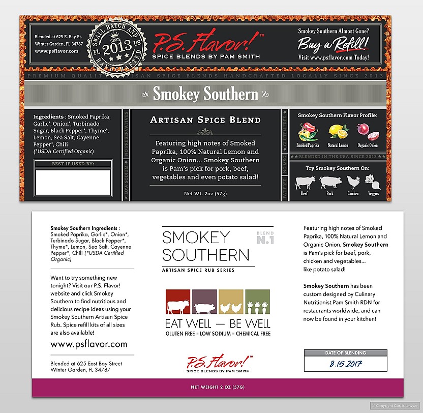
Label samples three and four from the initial round of presentations include a "transparent" label material, that would allow for the spices to show through a die-cut "looking" nameplate at the top of the bottle. Sample four is a real departure from the previous three, and provides a "modern utilitarian" look to the blends.
For now, I just wanted to show a few of the design samples that were created... and I'll write more about the design that was chosen, in a future post. This is a 5" x 2.5" single-label system that wraps around 97% of the primary spice blend product, which is a 2.8 ounce (give or take) glass bottle. The substrate is a metallic foil with a white ink undercoat and then spot/formula inks on top of that… which was needed for the smaller type to hold it's readability. The printing technique used would be a standard flexography process. This… was our blank canvas!
Stay tuned to find out which design sample was selected for the new P.S. Flavor!™ Branding Version 3.0 spice bottles!
*** Please Note – Any and all information used on the concept labels shown below should be considered as placeholder text and not actual nutritional or product information. The process of populating the labels with actual product information, happens during a production phase, toward the end of the design process. ***
RECENT ARTICLES


