time for a change
SITE NOTES
january 29th, 2017
internal
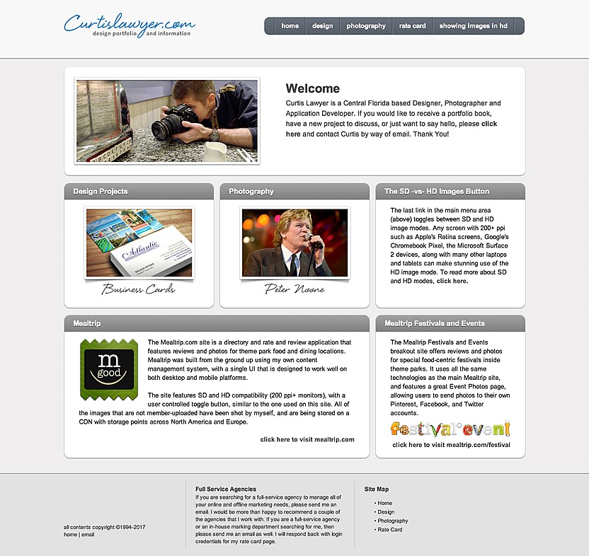
My main portfolio site doesn't seem to get updated much. The last iteration was launched in 2013. After four years, it still looked pretty good, but there were some functionality changes that needed to be addressed.
My 2013-2017 portfolio site design didn't look "that" dated, but it's layout structure made it difficult to use on small screen devices.
Today though, when I'm out in the field and all I have with me is a small device, I find myself wanting to show a page from my portfolio. This new generation site (I've lost track of how many different looks my portfolio has taken over the years… I think this might be v5.0), takes small devices into consideration more... and uses a special design core that I developed for other projects. It's lightweight, quick, and can be seen on just about any device.
Another change that would seem to work against the "speed" issue, is the removal of my SD/HD toggle. Back in 2013, there were just a handful of devices that supported "retina" density screens. Now, that seems harder to define. The pixel density on small screens and tables would seem to suggest that something higher than 72dpi would actually be useful. At the same time, a 144dpi image takes 4 times longer to download than a 72dpi image. Finding a balance between those two things, is something that should be based more on the purpose of the site than anything else.
Because this is a portfolio site, and most of the audience (i.e. individuals that need to hire a designer or photographer), are probably going to have decent connection speeds, I'm leaning a little more toward high density images.
Another new function, is the addition of this "blog" type entry system in addition to the engine that's running the actual image-based portfolio section. (These are all hand-coded applications that I developed years ago and not Wordpress or some other bulky CMS system). Obviously, I have used the blog engine on many other sites, but it wasn't part of my portfolio.
I decided to add the function because I do occasionally get to work on design, copywriting and photography projects that wouldn't otherwise get seen anywhere. Concert photography (for example) is something that I really love doing, but it isn't an extremely lucrative activity. I also have had several pet projects in the back of my head that I never seem to make the time to explore. Mostly because there's no client involved and no direct line to recoup an investment from (because everything costs, in one way or another).
I'm beginning to realize that working on one or more of these projects, would be a good thing. It might in fact, be an important thing for me to do. Adding this "blog" area to my portfolio and creating an articles about those projects, will give them a platform… a "reason", if you will. Because just doing some pet project for myself, seems to get lost in the day to day activities of life.
We'll see how it goes. Like new year's resolutions, the best intentions don't always turn into actions. I have a fairly realist approach to life… for a creative anyway.
RECENT ARTICLES


